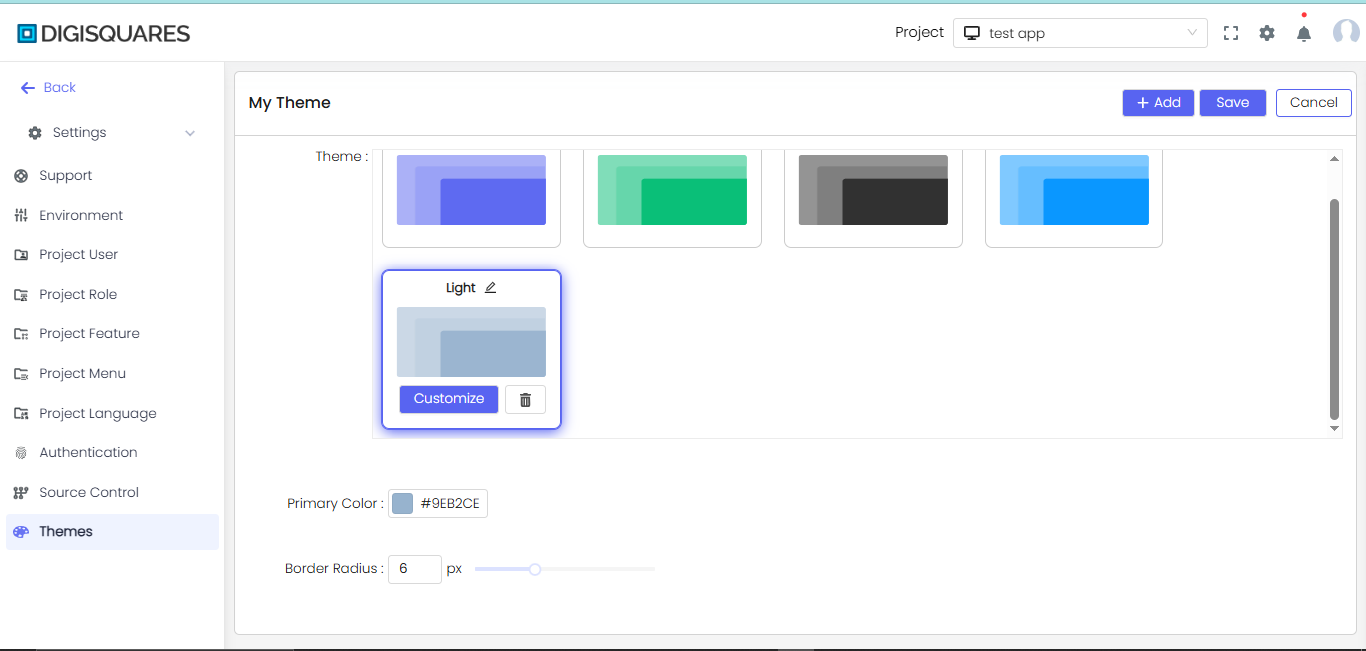
Custom theme settings
1. Global Settings
Creating Custom Themes
1. Customize your theme variables:
The CSS variables system enables complete design control through customizable tokens. Color tokens (--ds-primary, --ds-warning) define the core palette for all UI components. Font and spacing tokens establish typography rhythm and layout consistency. Style tokens like --border-radius and --shadow-medium standardize visual treatments across elements.
:root {
  /* Color Tokens */
  --ds-primary: #3498db;
  --ds-text-color: #333333;
  --ds-background: #ffffff;
  --ds-accent: #9b59b6;
  --ds-warning: #e67e22;
  --ds-error: #e74c3c;
  --ds-success: #2ecc71;

  /* Font Tokens */
  --font-family: "Segoe UI", sans-serif;
  --font-size-reset: 16px;

  /* Spacing Tokens */
  --size-base: 8px;
  --size-step: 4px;
  --spacing-reset: 0;

  /* Size Units */
  --size-unit: px;

  /* Style Tokens */
  --border-radius: 6px;
  --shadow-light: 0 1px 3px rgba(0, 0, 0, 0.1);
  --shadow-medium: 0 4px 6px rgba(0, 0, 0, 0.1);

  /* Development Aids */
  --wireframe-border: 1px dashed #ccc;
}

.button {
  background-color: var(--ds-primary);
  color: white;
  padding: var(--size-base);
  border-radius: var(--border-radius);
  font-family: var(--font-family);
}
2. Preview Theme Tokens (Map)
Visual swatches display all active color tokens for quick reference. The interactive map shows how tokens propagate through components. Hover tooltips reveal token names and current values. Live updates reflect changes made in the variable editor.
--ds-primary
--ds-warning
--ds-error
--ds-success
.png)
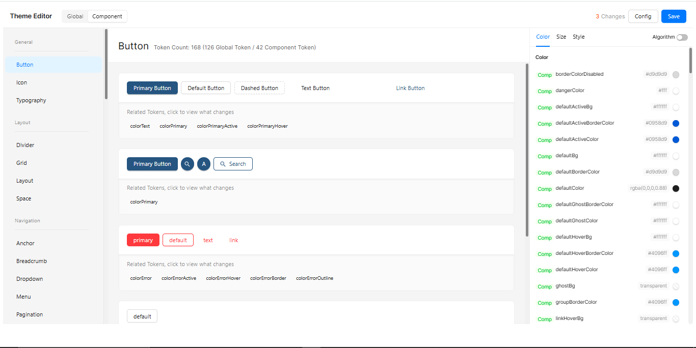
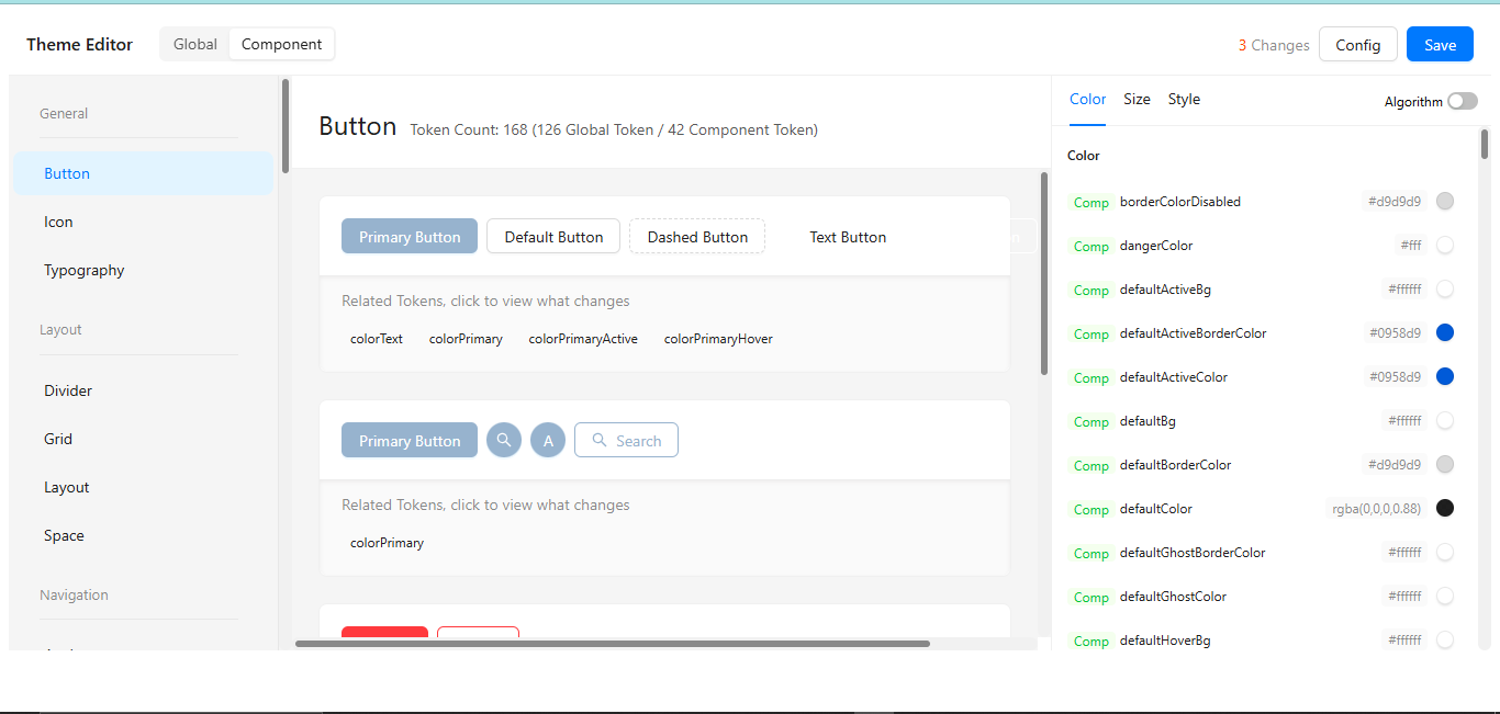
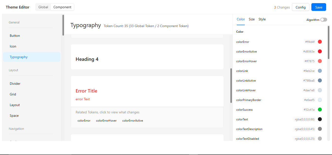
3. Theme Token Reference
The token reference provides a complete inventory of all customizable design variables, systematically organized by functional category (colors, typography, spacing, etc.). Each token entry displays the default value, intended usage context, and sample implementation code for immediate application. The table format enables quick scanning and comparison between related tokens, with syntax-highlighted examples ready for direct copying. This centralized reference ensures design consistency while documenting all available customization points.
🎨 Color Tokens
Define the core visual identity through a systematic color palette.the colors establish brand consistency across components.Semantic colors standardize feedback states. All values support HEX, RGB, and HSL formats for design flexibility.
| Token | Usage | Value |
|---|---|---|
--ds-primary | Main brand color | #3498db |
--ds-warning | Warning elements | #e67e22 |
--ds-error | Error states | #e74c3c |
--ds-success | Success confirmations | #2ecc71 |
🔤 Font Tokens
Control typography hierarchy with font family and size variables. Size tokens (--font-size-reset) maintain proportional scaling. Line-height and weight variables ensure readable text presentation across devices.
| Token | Description | Value |
|---|---|---|
--font-family | Base font family | 'Segoe UI' |
--font-size-reset | Default text size | 16px |
📐 Spacing & Size Tokens
Establish consistent layout rhythm through spacing variables. Base unit (--size-base: 8px) enables modular design scaling. The unit system (--size-unit) supports px/rem/em for responsive designs.
| Token | Description | Value |
|---|---|---|
--size-base | Base spacing unit | 8px |
--size-step | Step size for increments | 4px |
--spacing-reset | Spacing reset value | 0 |
--size-unit | Unit used for spacing/sizing | px |
🧩 Style Tokens
Standardize visual treatments with predefined style variables. Border radius (--border-radius) softens component edges uniformly. Transition durations and easing curves ensure consistent motion design.
| Token | Description | Value |
|---|---|---|
--border-radius | Standard border radius | 6px |
--shadow-light | Light shadow layer | 0 1px 3px rgba(0,0,0,0.1) |
--shadow-medium | Medium depth shadow | 0 4px 6px rgba(0,0,0,0.1) |
📉 Wireframe Tokens
Facilitate UI prototyping with development-focused variables. --wireframe-border highlights layout structures during design phases. Debug colors distinguish component boundaries in test modes. These tokens automatically disable in production builds.
| Token | Description | Value |
|---|---|---|
--wireframe-border | Border for wireframe mode | 1px dashed #ccc |
4.Preview Themes
Live preview pane shows multiple component states simultaneously. Toggle between light/dark modes to test appearance. Visual regression checks highlight unintended changes. Responsive controls verify mobile/desktop rendering.
5. Save Your Theme
Versioned saving preserves iteration history with timestamps. Name themes descriptively (e.g. "Dark-Mode-v2"). Shareable export generates portable theme packages. Organization-wide themes can be enforced by admins
Once your tokens are customized, save your theme with a unique name to reuse across projects.
Example Chart Visualizations
Here are some example visualizations created using Digisquares:
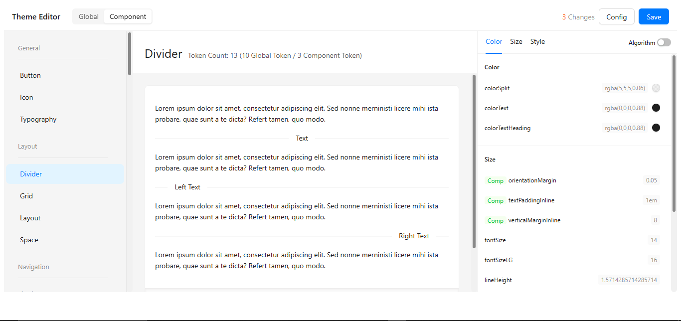
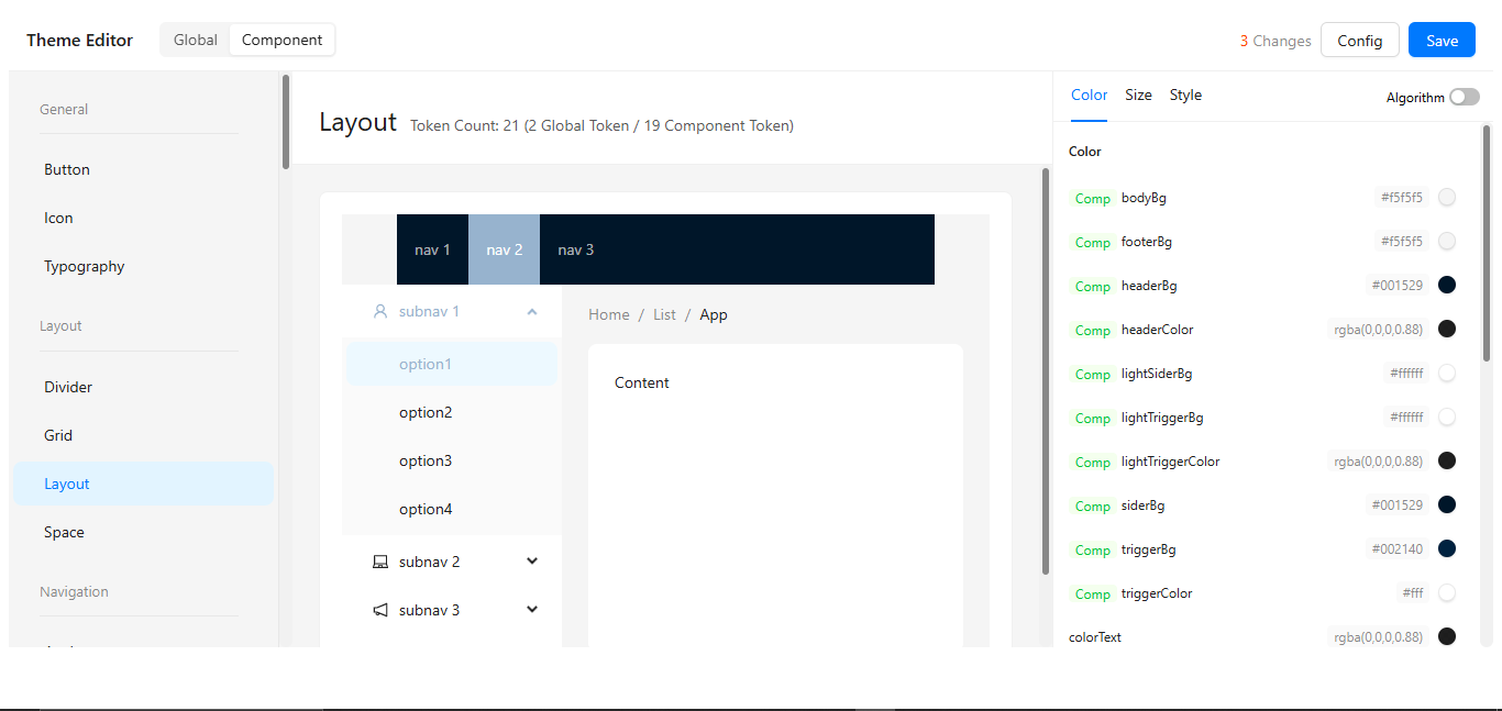
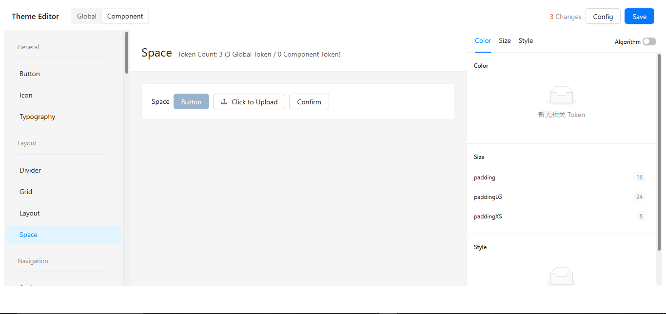
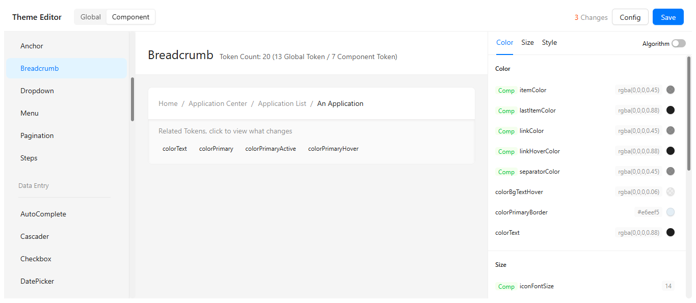
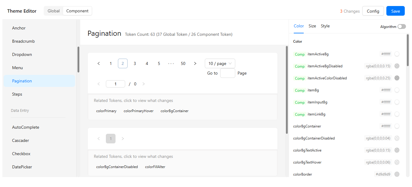
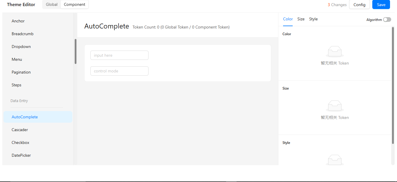
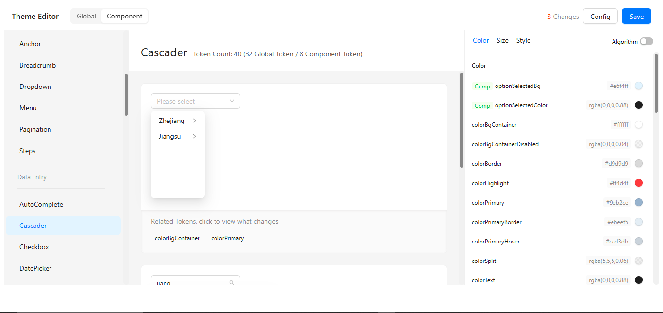
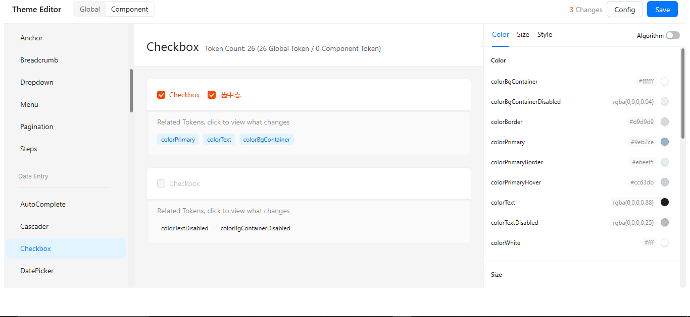
Component Customization Reference
Component Categories
Systematic organization of all customizable UI elements. General components (buttons, icons) inherit from base tokens. Specialized components (data tables, forms) have extended properties. Category-specific overrides available where needed.
| Category | Components |
|---|---|
| General | Button, Icon, Typography |
| Layout | Divider, Grid, Layout, Space |
| Navigation | Menu, Pagination, Steps, Breadcrumb, Dropdown |
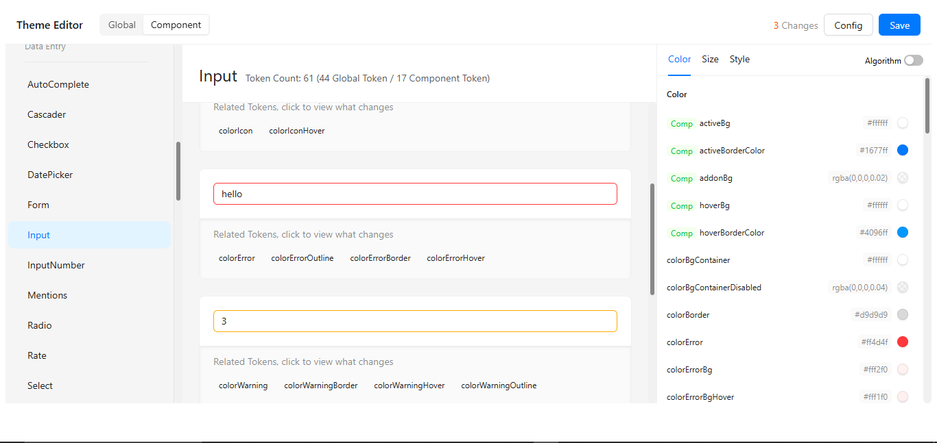
| Data Entry | Form, Input, Select, DatePicker, Checkbox, Radio, Switch, Upload |
| Data Display | Table, Card, Tabs, Tag, Avatar, Badge, Popover, Tooltip |
| Feedback | Modal, Notification, Message, Alert, Progress, Result, Spin |
Customization Guide
Step 1: Access Theme Builder
-
Click the "Open Theme Builder Launch through project dashboard" button below:
-
Authenticate if required
-
Select your project context
Step 2: Modify Values
// Example theme configuration object
{
  "colors": {
    "primary": "#1890ff",
    "secondary": "#13c2c2",
    "success": "#52c41a",
    "warning": "#faad14",
    "error": "#ff4d4f"
  },
  "typography": {
    "fontFamily": "'Inter', sans-serif",
    "fontSizes": {
      "base": "14px",
      "large": "16px",
      "small": "12px"
    }
  },
  "spacing": {
    "base": "8px",
    "large": "16px"
  }
}
Component Inheritance Flow
Visual hierarchy showing token propagation flow. Base tokens cascade to all components. Component-specific overrides take precedence. Fallback values ensure consistent rendering.
Step 3: Preview & Save
-
Live Preview Panel
- See changes in real-time as you modify values
- Toggle between light/dark modes to test appearance
-
Component Testing
- Verify styles across different component types:
Buttons → Forms → Data Displays → Overlays - Check responsive behavior at different breakpoints
- Verify styles across different component types:
-
Version Saving
- Use descriptive comments:
"Dark theme v1.2 - Updated primary palette (#1890ff → #1a73e8)" - Include date and author initials when team collaborating
- Use descriptive comments:
Best Practices
✅ Version Control
- Save directly over existing themes
+ Create new versions before major changes (v1.0 → v2.0)
📝 Documentation
- Record all custom values in
/docs/theme-guide.md - Note special cases (e.g., "Table headers use @primary-color-dark")
- Include screenshot references
👁️ Accessibility
/* Minimum contrast standards */
body {
  color: #333; /* Text */
  background: #fff; /* BG */
  /* Contrast ratio: 12.63:1 ✅ */
}
📏 Consistency
// Recommended spacing scale
const spacing = {
  base: 8, // All multiples of 8
  sm: 8,
  md: 16,
  lg: 24,
  xl: 32,
};
💾 Backups
Export command example
digisquares-cli theme export --file=backup-2023-11-15.json